

This is a photogram by William Henry Fox Talbot of an Insect wings circa 1840. Fox Talbot often used a portable camera obscura and he used it to trace images. He was so in ore of the image projected onto the ground glass, and so appalled by his own tracings that he went to work on his positive/negative process.
His first experiments with light sensitive material used objects placed directly onto the paper.
Where the light hit the paper it was exposed and where the object stopped the light it wasn't exposed.
The exposed areas turned black once they were developed and the unexposed areas remained white - and the areas in the middle came out various shades of grey.
By this process an image is made - a Photogram.
Photograms are created without a camera and Fox Talbot had to produce them to experiment with his Light sensitive material.
However, there is a genuine beauty in photograms partly due to their direct relationship to the object they depict. These insect wings have been projected onto the paper and show every detail - far beyond the detail capable of being captured by hand. Fox Talbot was so impressed by this he called his first book The Pencil of Nature referring to the act of capturing objects with light. They have the look of a Death Mask or Foot Print as they are a trace of the thing they depict.

This is a cyanotype by the botanist Anna Atkins circa 1850's. traditionally botanists made intricate, precise and delicate drawings so they could document different species for scientific records. She is the first photographer to publish a book with photographic images. Cyanotype are exposed to sun and developed in water. If exposed correctly they create rich blue image with subtle details and it can still be bought here.
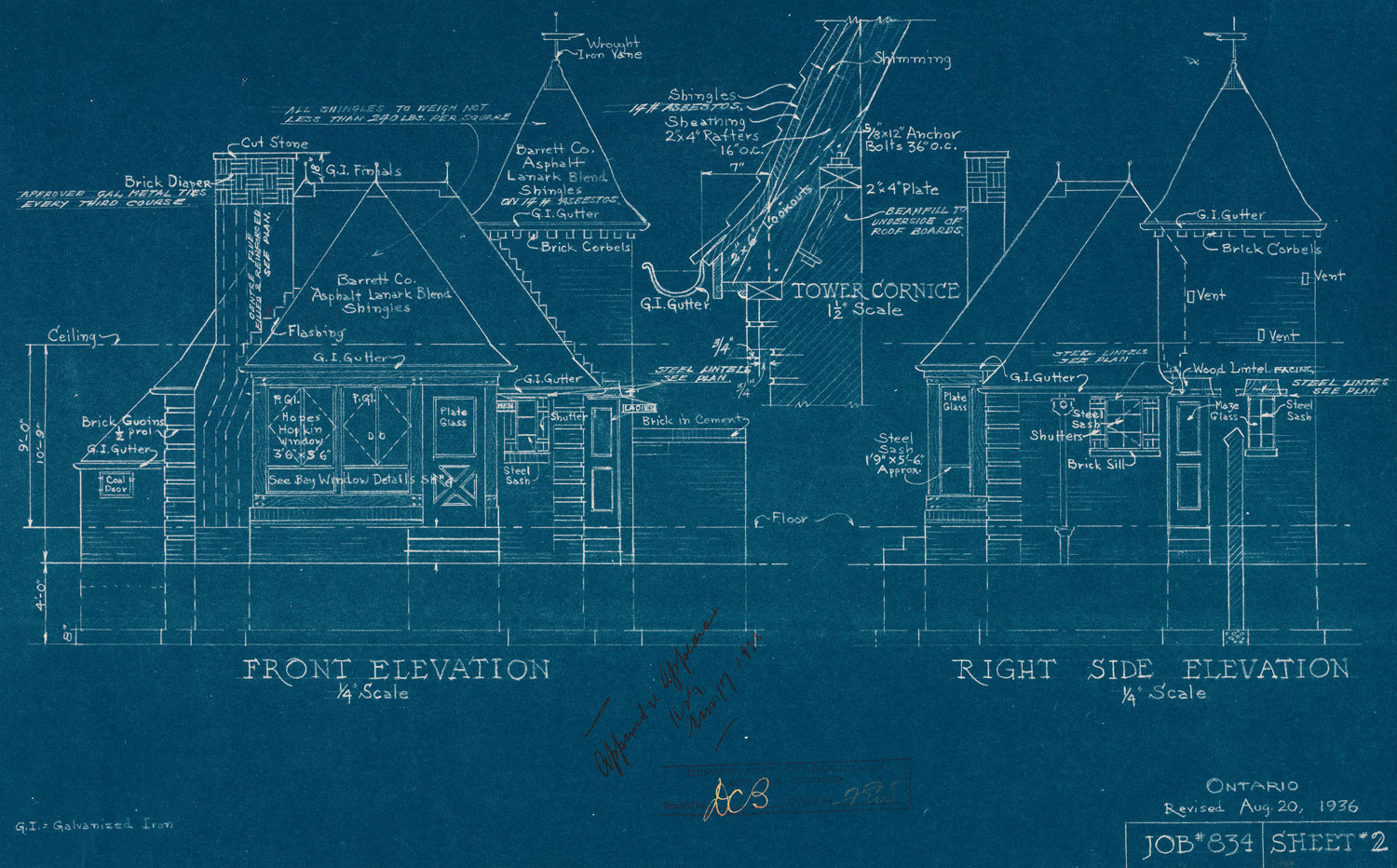
The Cyanotype process was used to create large reproductions of plans and designs. These images became known as Blueprints due to the rich prussian blue created by the process. One major advantage with the invention of photography was its ability to copy and reproduce drawings, diagrams and works of art. There was a time when if you wanted a copy of a drawing or painting you would have to draw it yourself by going to visit the actual object. Now we see reproductions of art, diagrams and images all the time. The original Blueprint was a copy of a drawing and the above image is a copy of that - broken down into pixels and glowing at you from a screen.

This is a Rayogram by the 20th century artist Man Ray. It is actually a photogram but in a bold act of self promotion Man Ray called his images Rayograms. Coiled paper has been placed on the photographic paper casting shadows which in turn create gradient tones. A sequence of circles getting larger travel from the top left hand corner of the image. These images were produced in the 1920's - eighty years after Fox Talbot. In many ways these were still early days for photography and photographers were just starting to create images that were their own thing - not just mimicking painting. Man Ray was originally a painter but had used the relatively new medium of photography to find new forms and a new aesthetic. The generation before had questioned the very notion of painting because of the invention photography. Look at the expressive brush marks, subject matter and compositions (especially Degas) of The Impressionists to see.
Man Ray was a key member of the Dada group and he went on to be part of the surrealists. If you follow the Dada link there is a wonderful documentary that will give you a bit more insight.


Alvin Langdon Coburn 'Ezra Pound' 1917
This photograph by Alvin Langdon Coburn creates a vortex effect from a simple portrait shot. It is an image of Ezra Pound who was a key member of the English Vorticism group (Vorticism shared qualities with Cubism and Futurism). In the darkroom the paper has been exposed three times - with each exposure the image has been re sized and refocused. Exposure time would have to be reduced so the paper did not become over exposed.

Alvin Langdon Coburn 'Vortograph' 1917
At his best Coburn experimented with unusual viewpoints and created some of the first abstract photographs with his 'Vortographs'.

The Photogram is over 170 years old and there are still artists exploring the possibilities of camera-less photographs. This could be nostalgic but there might be other reasons. A digital print has been captured on a digital sensor then sent as information to a computer. This information is then sent to a printer which then mechanically adds ink to the surface of the paper. A traditional print has light projected onto it from the original negative. The negative itself had light from the thing it depicted projected onto it. The original prints relationship to its subject is more direct. A photogram has the object placed directly on top. In a digital world the 'thingness' of a photogram is unusual.
The image above is a camera-less colour photogram by Garry Fabian-Miller. He fills vessels (for example a glass container) with different liquids and passes light through it. He also cuts out shapes from paper to create his large abstract images. The images are modernist and minimal sharing qualities with the work of James Turrell, Mark Rothko and Ellsworth Kelly. Fabian-Miller seems to capture the magic of photography in his images.

Floris Neususs - Untitled 1962
A curled figure in the fetal position is framed by the square edge of the photograph. Areas are blurred while other areas are pin sharp. This image by Floris Neususs 'Untitled 1962' who with Fabian-Miller was in 'Shadow Catchers' at the V&A in London. The exhibition looked at work by contemporary photographers who create Camera-less images you can view videos of each artist discussing there work here.
Walter Leblanc - 'Serie New York, 10' 1977, Photogram and pencil on paper

Harold Feinstein has used a scanner to create this image. He has laid the foilage directly onto the scanner and scanned the image with the lid up - creating the dark background. This is a digital version of cameraless photography and create a hyper real image.


Saul Bass 'San Francisco Inernational Film Festival' 1961
This is a poster deigned by Saul Bass based around a ball of film. The flat graphic ball of film surrounds a small globe illustrating the world film festival. The use of one colour (blue-teal) with black and white very well and also seems of its time. The text is very simple and has a utilarian feel - it is simple and clear but does not take away from the main image.
The ball of film has the look of photogram and a similar effect could be achieved by creating a photogram, scanning it into Photoshop and adding colour and text.

Laszlo Maholy Nagy - Photogram (date unknown - 1920s?)
This Photogram by Laszlo Maholy Nagy is a good example of a coiled film captured on photographic paper. Maholy Nagy was not interested in making recognisable photograms and instead wanted to explore the medium for its abtract tendencies. He would take objects from the everyday world and turn them into to some else - something strange. The same forms appear in his photogram as in his paintings and photographs - especially circles and diagonal lines.

Saul Bass -Poster for 'Vertigo' 1958 dir. Alfred Hitchcock
This is Saul Bass' poster for Alfred Hitchcocks film 'Vertigo'. Part of the plot involves the lead character having vertigo and Bass captured the disoriatating and dizzying effect in both the poster and the title sequence (which he also created). This was achieved in the poster by using the geometric spiral shape overlaid with simple graphic figures. Similar to his Film Festival poster he has used one colour (this time orange) with black and white. Rather than using a simple font he has created his own font from cutout paper that has then been stylised. He used this font in several posters and title sequence - and it is used today by designers trying to achieve a 1950's style.


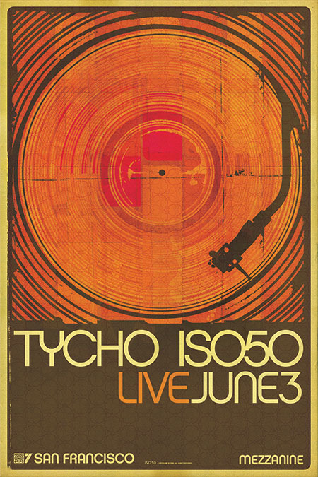
Graphic designs by ISO50
ISO50 (Scott Hansen) combine the curves, spirals and patterns that are found in Art Nouveau and combines them with old textures , marks an, photographs and paint splatters. The splashed marks on a Photogram (made by chemicals) combined with other photographic elements could create this effect. Technology often effects the art of its day - from oil paints, the printing press, the camera and, today, photoshop and the internet. The simple bold vector forms are given a worn texture and the faded colour and images give the images a retro feel. You can learn how he created these images in PDF tutorials here.

Book Jacket Designs for Christian Kracht by Isaac Tobin
A lot of modern graphic design has this feel of nostalgia and combines textured surface, photographs, typography, forms and flat areas of colour to create a nostalgic and retro feel.

A collection of designs by Brent Couchman

