

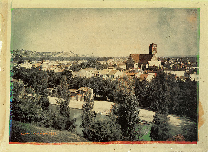
“Landscape in Southern France” by Louis Ducos du Hauron, 1877


Hand tinted Daguerreotype 1855 by Tyler & Co
Sergei Mikhailovich Prokudin-Gorrskii 1910 -1915

Alfonse Van Besten, 'Stagecoaches at Korenlei, Gent' c. 1912, Autochrome
If you have an Photographic image in your head of the early twentieth century, the odds are it will be in black and white. We see it this way because the majority of photographs were taken in Black and White. Experiments with colour photographs started in the early 1840's, almost parallel with the announcement of the invention of photography (1839). Hand tinting, Cyanotypes, Autochromes were all early examples of adding colour to images but they were all labour intensive, expensive and didn't produce accurate results. Several of those processes can be explored here.

Colour has power.
A Photograph should only be in Colour if it is essential to the image.
We live in a world were we are surrounded by Synthetic Colour. Even under the granite grey skies of Britain we have 24hr access to bold bright colours - plastic, clothes, fabric, TV, computer screens - the list goes on. Once people only experienced the colours in nature and objects that had colour had monetary worth. We take colour for granted - we have become blind to colour. To truly appreciate colour it is worth considering Black and White.

Tony Cragg - A sculpture made from found pieces of plastic
Black and White photography had a good 80 years head start before an acceptable colour process was developed. Even then, it was nearly another half century before documentary photographers began to take it seriously. Black & White had authority; it distanced the audience from the everyday world of colour; it lifted the photograph from its surroundings and, possibly, made it art.

William Eggleston: Karco, 1983–1986


William Eggeston 'Untitled' 1971-1973 (from 'Troubled Waters' 1980)

William Eggleston 'Untitled' 1965-68 (from Los Alamos - read article here)

William Eggelston 'Untitled' 1975
'William Eggleston, known as “the Father of Colour Photography”, possessed a kind of mischievous punk aesthetic when he clashed with the photographic orthodoxy in the mid-Sixties. Back then colour was used for advertising and family snaps, and any photographer with artistic pretensions stuck to black and white. Not until 1972 did his quirky, colour-drenched representation of the world enter the hallowed halls of MOMA New York.
Eggleston’s other legacy was his choice of subjects: empty streets, random domestic objects and chaotic interiors, nondescript buildings. Banal and ordinary, and photographed on walks around his hometown, Memphis, he found them interesting, beautiful even, as other photographers ignored them.
But decades later, his influence is universal: now we see beauty where he saw it then.
In the 21st century, only subtle changes have tweaked his style; empty streets remain nondescript without the eerie narratives of Gregory Crewdson’s; still chaotic, unstyled interiors now seem retro; only the Russian calendar girls (2001) in a boy’s bedroom are animated.


William Eggeston 'Untitled (Freezer with Ice bags, Kentucky)' 2000
The novelty now lies in the new abstraction. Untitled (Freezer with Ice Bags, Kentucky, 2000) is a gorgeous painterly view from inside a freezer, the misty iciness muting the colours to pale polar blues, and icy ridges creating a sensual pattern.
That fascination with design continues where a palm tree bisects a green wall like a lush Barnett Newman experiment. Eggleston famously takes just one shot, as if for a painter’s notebook, and his attraction to these bold fields of colour also suggest a painter’s eye. Few will match Eggleston’s modest, certain sense of beauty.' (from an article by Sue Steward)


 A drop of milk landing onto a red biscuit tin lid – creating a beautiful crown. The bold white contrasts against the rich red and the rim of the lid adds an unusual horizon line to the composition. The image is saturated by that red - it does something to us. Our reaction is almost primal.


Joseph Albers 'Homage to the Square: Apparitio' 1959
The world is vast - there are many subjects that an artist or photographer could choose as the focus of their life's work. What should you choose? What element of the world deserves your focus?
It is possible for any artist to create one great image, or a photographer to take one great photograph. However, it is harder to create a body of work and many of the artists that we go back to created a body of work that returned to certain themes.

A selection from the series 'Homage to the square' Joseph Albers
The Bauhaus artist and teacher Joseph Albers spent the last 25 years of his life dedicated to Colour theory. His most famous series of work is 'Homage to the square' 1950 - 1976 was a series of paintings that explored colour. Each painting consisted of several squares on top of one another. Each square was a different colour and depending on the combination would create different effects. Some colours would complement one-another and be calming to the eye. Other combinations would create bold graphic images where the squares would hum, buzz and bounce off one another. This dedication to one simple theme could seem tedious but also shows how art can help you appreciate the simple elements of life.
'Easy to know that diamonds are precious
Good to learn that rubies have depth
But more to see that pebbles are miraculous'
Joseph Albers

Laszlo Moholy-Nagy "Study with pins and ribbons" 1937-38

Madame Yevonde c1930's


Keld Helmer-Peterson from '122 Colour photographs' 1948

Saul Leiter 'Haircut' 1956


Luigi Ghirri 'Paris' 1972


Luigi Ghirri 1972
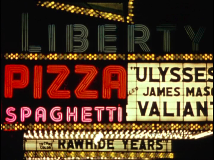
Still from William Klein's - 'Broadway by Light' 1958

stills from William Klein's 'Broadway by Light' 1958
These still images from William Klein's mediative study of New Yorks Times Square is a 12 minute expressionistic film (watch it here). It focusses on iconic advertising - especially the neon typography and bold colours.


Franco Fontana 1979


In this minimal photographs John Batho's has warm rich red and oranges jump out against the subdued blue hue of the back ground. Red is one of the Three Primary Colours (In Art they are Red, Yellow and Blue - although light is different). We associate red with blood, fire,anger , danger - it has visceral affect on us. We even use it in language - Seeing Red means extreme anger and Red Hot suggests extreme heat.Such a colour has great power and has been used throughout the history of art.
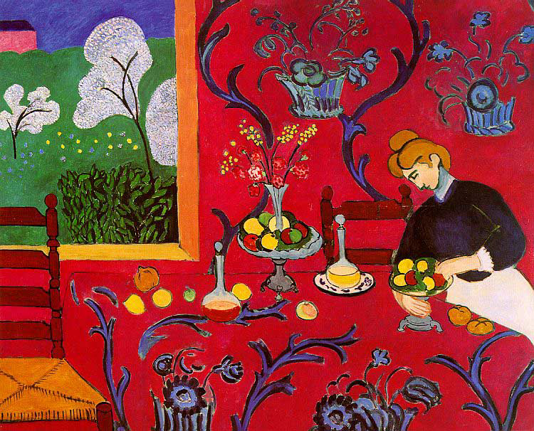
Henri Matisse 'The Dessert: Harmony in Red' (1908)
Matisse's early work show a huge move away from the traditions of western art. He was a key member of the Fauves ('The Wild Beasts') who used colour and brush marks in a unseen expressive way. However, Matisse once said he wanted his work to have the same effect as a comfortable chair on a tired business man. This seems at odds with his contemporaries, for example Picasso and his delight in challenging the viewer. Mattise's red consumes us and reacts against the coloured objects on the table.
William Edgerton - 'Red Ceiling' 1973


Rothko
This is a painting by the abstract expressionist painter Mark Rothko. His work used a variety of hues that are designed to have a direct affect on the viewer - the colours affect you on a visceral level.

 This is a late period Rothko, created a year before the artist committed suicide. It displays the dark bluey grey colour palette that Rotko used during his last years of life, a period that was said to be increasingly lonely and isolating for the artist.


Rothko 'No 27 - White Band' 1954
Another painting by Rothko and by changing the colour the feel, the atmosphere and mood changes. Blue is another Primary Colour and we see it as being cold, atmospheric and representing a melancholy mood(as in having the Blues and Blues music).
Casper David Friedrich 'Monk by the Sea' 1808 - 1810
A lone figure gazing out an an expanse of sea. Most of us have gazed out to sea and gained a sense of the vastness of the world, of the universe - this is the sublime. Casper David Friedrich breaks the whole world down to three elements - the blank foreground of land (earth), the blackish murky sea (water) and the vast empty bruise like sky (Air). It is almost abstract if seen through half closed eyes. It could be a late period Rothko with the same elements of bleakness and emptiness.

Pablo Picasso
During his early Blue Period (1900-1904) Picasso used a limited palette. The limited blue palette, combined with the figures expression, posture and clothes, add to the melancholic feel of this work.

Anish Kapoor- 'European Pot For Her' 1985

The artist Yves Klein work with a chemist to create his own, unique, blue - he called the result 'International Klein Blue'.

JFK TURNER 'Untitled' Found, Object College, 2000-2004


Experts estimate that there are about ten million colours, but only several hundred have names. Often one word is not enough to describe the colour (ruby red, chocolate brown, bluey green etc). In this water colour by Callum Innes simple bands of colour may have an overall blue hue but there are hints of grey and oranges and purple.

Rothko
The third and final Primary Colour is Yellow. Again it has its own characteristic and changes our mood.

Rosalie Gascoigne 'Dandelion' 1990
Rosalie Gascoigne was an artist who created beautiful assemblages out of everyday found objects (watch a interview here). By combining small fragments of the same colour object large expanses were created - like dashes of paint on canvas.

Vincent Van Gogh 'A Field of Yellow Flower' 1889


Joseph Albers 'Study for Homage to the Square:Departing Yellow' 1964

When you mix the three Primary Colours of paint you get the Secondary Colours, and when you mix the secondary colours you can create a vast array of colours and hues. In this Colour Wheel (see history here or here) the three primary colours are in the centre, the next ring of colours are the secondary colours and they gradually becoming lighter in tone as they get further away.

Claude Boutet Colour Wheel from 1708 edition of 'Traite de la Peinture in Mignature'
In the above left colour wheel we can see The Secondary colours. Red and Yellow = Orange, Yellow and Blue = Green and Red and Blue = Purple. Although it does not show it if you mix all three primary colours you get Brown (add a touch more red you get a red brown, add more yellow it's a more earthy brown etc). If you mix the Secondary colours together (or a primary colour with a secondary colour you get a Tertiary Colour).

Illustration from a 1924 'How to Book" showing complimentary colours

Henri Matisse 'The Snail' 1953 Gouache on Paper
This is Matisse's 'The Snail' in Tate Modern. The works seems simple but it is perfectly composed and has a visual rhythm. This is a collage made from pieces of paper painted different colours (this part was done by Matisse’s assistant’s). It's 1953, Matisse has cancer, he's very ill. Between him and the assistants the work somehow gets done: the sheets are torn, their edges changed, and the resulting shapes are stuck onto a white ground. He makes a natural, organic form: a spiral. But the shapes themselves are not particularly natural. As well as torn edges there are plenty of hard straight lines. There aren't any straight lines in nature. So Matisse makes you re-see nature by creating it in an unexpected way.