|
Joseph Albers 'Homage to the Square: Apparitio' 1959
The world is vast - there are many subjects that an artist or photographer could choose as the focus of their life's work. What should you choose? What element of the world deserves your focus?
It is possible for any artist to create one great image, or a photographer to take one great photograph. However, it is harder to create a body of work and many of the artists that we go back to created a body of work that returned to certain themes. A group of images (paintings, photographs, sculptures etc) with a similar theme is part of a series.
A selection from the series 'Homage to the square' Joseph Albers
The Bauhaus artist and teacher Joseph Albers spent the last 25 years of his life dedicated to Colour theory. His most famous series of work is 'Homage to the square' 1950 - 1976 was a series of paintings that explored colour. Each painting consisted of several squares on top of one another. Each square was a different colour and depending on the combination would create different effects. Some colours would complement one-another and be calming to the eye. Other combinations would create bold graphic images where the squares would hum, buzz and bounce off one another. This dedication to one simple theme could seem tedious but also shows how art can help you appreciate the simple elements of life.
'Easy to know that diamonds are precious
Good to learn that rubies have depth
But more to see that pebbles are miraculous'
Joseph Albers
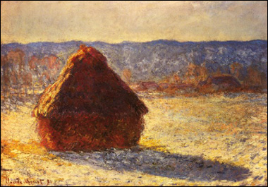
Claude Monet’s haystack.
One of the first artists to create works in a series was the impressionist Claude Monet. Monet began to explore the same subject repeatedly in what are known today as his series paintings: grainstacks, poplar trees, Rouen Cathedral, and other subjects, some near his home, others in places where he traveled, such as England, Norway, and Italy. Finally, in the last decades of his life, Monet devoted his entire artistic attention to the lily pond in the garden he created at Giverny. Today most artists work in a series - arguably Monet started this trend.
A group of Monet's Haystacks
As an impressionist painter Monet was fascinated by light. The warmth of the early morning light, the strong contrast of midday, the golden hour when the sun begins to set, twilight or the diffused light on a cloudy day. When he visited London he didn't see dullness, instead he was amazed by all the different shades of grey and white. During the harvest season of 1890 -91 he returned to the same hay stacks and painted them on site. The same ordinary subject is transformed by observing how the light changes at different times of day and year. Although technically a series of images there is a sense of time passing and the images seem to follow a natural sequence.
Boris Mikhailov - Red Series
Tease any thread and the world unravels.
Bernd & Hilla Becher, Gas Tanks, 1983-92
The series of images above are by Bernd and Hilla Becher. They are a husband and wife team who are famous for taking photographs of obsolete industrial architecture. The beauty of the buildings comes from their form following their function. These images are photographed in a systematic way, from the same viewpoint and displayed in a uniform grid formation. From this pseudo-scientific approach a simplistic beauty emerges.
Idris Khan, 'every…Bernd and Hilla Becher Spherical type Gasholders' 2004
Idris Khan is a contemporary photographer who overlays the work of others on top of one another. The top image shows where Khan overlaid the Bechers water tower series. This has given the image the feel of a charcoal drawing and the images have an eerie, ghostlike atmosphere. Although these images are not fast shutter speed examples they show a life times work in an instant – warping time by showing the work in an instant.
Bernd and Hilla Becher
The Becher's were part of the "New Topographics: Photographs of a Man Altered Landscape" exhibition in New York (1975). The work in this exhibition was presented uni formally (Each photographer in the New Topographics exhibition was represented by 10 prints. All but Stephen Shore worked in black and white). Each photographer looked at the modern landscape and their work had a cold objective feel. This influential exhibition included The Bechers, Henry Wessel, Stephen Shore, Robert Adams and Nicholas Nixon.
Nicholas Nixon 'The Brown Sisters 1975-2007' 2/16/09
Nicholas Nixon 'The Brown Sisters 1975-2007'
Time has a natural effect on the world around us. Time is a central element of Photography - at it purest form it can be the length of time a shutter is left open for. On another level it can record time - freezing it forever. We cannot see time - we invented clocks to give form to this abstract concept. However, we can see the effects of time - the sun moving over head, a worn step, a landscape eroding or the aging effect on humans. We notice people growing old mainly by looking back at old photographs. The Photographer Nicholas Nixon has Photographed his wife and her three sisters ever year since 1975. They are informal portraits but the women are always stood in the same order. If you look at the photographs chronologically the change is subtle. However, if you look at a photograph from the 1970's and compare it to a recent one the change is dramatic. Soft skin and features age and show the marks of a life's experience. Individuals faces can still be recognised but, at the same time, can change dramatically. This work could also be described as a Sequence because the images should go in a certain order.
Walker Evans 'Subway Portraits'
|
A section from Peter Blakes Alphabet (after Walker Evan) 2003
The British Pop artist Peter Blake created a whole alphabet by taking close up shots of street signs. Blake was inspired by the American photographer Walker Evans who, after a life of black and white photography, used a cheap colour Polaroid camera to photograph the every day and mundane. Blake, like many artists, has several collections. Like a magpie he collects anything that captures his eye. Blake's collection was shown at the Museum of Everything #3 in an old warehouse.
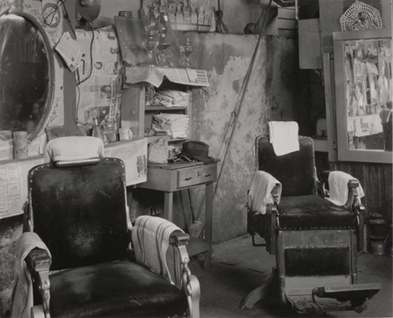
Walker Evans 'Barber Shop Interior, Atlanta' 1936
Walker Evans is one of the key photographers of the twentieth century. His keen, objective images have had a substantial effect on the medium. He captured crisp images of subjects that most photographers wouldn't look at - An old sign, an open door, a shop window. He originally wanted to be a writer and his images seem like descriptions from literature e.g.. an Interior of an old barber shop.
Evans would photograph things that at the time seemed everyday but he knew in the future would be of interest. This image of a petrol pump station seems intriguing today with its combination of hand painted signs and old fashioned looking petrol pumps. If the the pumps were around today they would be antique and photography has that ability to freeze time. Every photography is tinged with nostalgia.
Walker Evans, "Joe’s Auto Graveyard, Pennsylvania," 1936
Walker Evans Polaroid from 1970's
Evans was aware an old object discarded would have worth when viewed in the future. Cars are designed to be used and, like chairs, when they are abandoned they seem sad. They almost have human qualities - we can almost make out faces in their features.
Signs Collected by Walker Evans 1970-75
Evans also collected objects - trash, signs, bottle tops. He collected objects in the same way as he collected photographs - as if the camera has the ability to capture a piece of the world with a click of a button.
'Signs, New York' 1928–30 Walker Evans
Is there a huge difference between taking a photograph of a sign and collecting one off the street. In both cases you end up 'owning' it.
Evans was also aware of how a photograph or a sign preserves a passed society - and the more time passes the more exotic the photograph or object can become. A photograph is a moment in time but it can also contain years, decades.
Walker Evans - Penny Picture Display, Savannah, Georgia 1936
In this photograph by Evans he has photographed a set of Photographs. This is something he returned to again and again - the layers build up and you are looking at an image of an image. It is a shop window display in a penny photo arcade - people would go in to have a portrait taken as a memory. We photograph ourselves to prove we existed - we were here. These original images are not art in themselves but Evans photographs them and draws our attention to them. The act of using the work of others is know as Appropriating.
In addition to photographing displays of photographs Evans also collected photographs - especially Postcards. Evans was as much a collector of things as he was a photographer - photography is an act of collecting or capturing.
Above are two examples of Martin Parr's Boring 'Postcard' collection. Like Peter Blake and Walker Evans, Parr collects as well as creates. Parr has said “I have a very strong collecting gene,”. As well as postcards he collects...
Watches of Dictators
Souvenirs
and Pop Star Memorabilia.
He collections was put on display in an exhibition called 'Parr World'.
Martin Parr Individual photographs from 'Common Sense' 1995 - 1999
Martin Parr 'Common Sense' Series (displayed on a gallery wall) 1995-1999
Like Evans, Parr photographs as if he is collecting. In his 1995-99 Series 'Common Sense' he focused on minor trashy elements of everyday life - lipstick marks on a cup, finger marks on buttons or a cup of tea on a table cloth. He uses a ring flash to create bold, saturated colours giving his work the look of the hyper real. Does Parr have a genuine affection for his subject matter or is he poking fun? Arguably he is somewhere in the middle - or neither - he just records and collects.
Martin Parr's collection of plates commemorating the 1984-85 miners' strike
The need to collect, gather, document and record is part of human nature. Science, the food chain, top ten lists, clothes, shoes, stamps, food wrappers, light bulbs, pins, friends on face book - most people, when they consider it, collect something. A collection of photographs serves the same need - to document and record - and when you look closely and compare their are difference between things that seem the same.
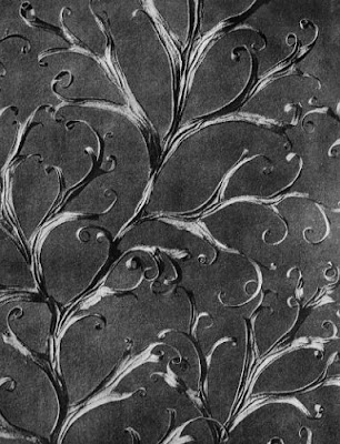
Examples of the work of Karl Blossfeldt (1865 to 1932)
Sculptor & art teacher Karl Blossfeldt is best known for his beautiful photographs of plants forms. The close up images help us see, through the cameras lens, images we wouldn't see with our eyes. Seed, leaves and stems appear as figures or alien creatures. Strange sculptural objects and forms are found in nature. A systematic objective approach that seems to show us the real world actually abstracts it and makes it strange.
Originally, the photographs were intended to be used as teaching aids - subjects for art students to work from,. However, the images became popular when a selection of his photographs were published in the book Urformen der Kunst (Archetypes of Art) in 1928. The book created a sensation in the photographic world & Blossfeldt was rushed to the fore in the German post World War I movement to abandon the soft focus, impressionistic style in favor of a direct lighting & sharp focus approach. His direct objective approach towards photography and his methodical use of a system predicted the way many modern photographers work.

Suren Manvelyan 'Your Beautiful Eye'
These images by Suran Manvelyan uses a macro lens to show the human eye in detail. They look like planets, craters, rivers and mountain ranges. Like Blossfeldt the hyper real approach actually has the opposite effect - the seem alien to us. These images have been described as beautiful, which on one level they are, but they are also ugly and terrifying.
Stephen Gill 'A series of Dissapointments'
Stephen Gill is a contemporary British photographer who often works in a series. He will often focus on subject you would normally pay no attention to - A lost stranger looking at a map, painted over signs, the backs of bill boards or people sat on trains. His work shares the straight forward irony of martin Parr, the cold methodical approach of The Bechers and the fascination with the everyday of Walker Evans.
His series 'A Series of Dissappointments' looks at the proliferation of betting shops in the Borough of Hackney. The discarded slips 'were shaped by loss or defeat, then cast aside. these new forms perhaps now possess a state of mind, shaped by nervous tension and grief. After these images were made, little autopsies were performed on the papers to reveal the failed bets held within.'
In our modern consumer world we rarely 'Make do and mend' - we just use things and discard them. A chair is designed for a person to sit on - it isn't whole when not in use. The chair has legs like us - when it is abandoned it looks like a injured creature that has been abandoned. A carpet slumps in a corner of an alley like a frail old man. These discarded objects were photographed on the streets of Southwark in south east London by Guy Batey. If you walked past them they could be easily missed and ignored. However, when gathered together and presented (with a perfect title) they take on a life of they own. The photographs has a simple, quite quality and, as the title suggests, a melancholy feel.
Richard Wentworth 'Making do and getting by' ongoing project
Batey's 'The Melancholy of Objects' remind me of the photographs by the British sculptor Richard Wentworth. Wentworth's work (see 'Making do and getting by' and the work of Jane Fulton Suri) is an ongoing conversation with his native habitat, fuelled by daily walks down the Caledonian Road and expeditions into the hinterlands of King's Cross. In photographs, objects and lectures he charts the contours of the inner city, the ebb and flow of urban life, the things that change and the things that never do. Wentworth and Batey are part of a long tradition of photographers who roam the streets with their cameras.
"The photographer is an armed version of the solitary walker,"
"reconnoitring, stalking, cruising the urban inferno, the voyeuristic stroller who discovers the city as a landscape of voluptuous extremes."
Susan Sontag in On Photography,
Sontag's "voyeuristic strollers" included Atget, Brassai and WeeGee, all of whom were "not attracted to the city's official realities but to its dark seamy corners, its neglected populations". She could also have mentioned Bill Brandt, an often-solitary wanderer on the night-time streets of wartime London, or Cartier-Bresson, forever in search of the decisive moment, as well as all manner of street photographers, from the frantically obsessive Gary Winogrand to the gently observant Helen Levitt. (words by Sean O'Hagan).
Eugène Atget's 'Le Cirque' (1924)
Eugène Atget's 'Saint Cloud' (1921-1922)
These images by Eugene Atget show Paris caught at night and in the early hours of the morning. These city shots have no people in them - a world built by people for people but empty. The same space that during the day would be full of people take on a new life at night - they become deserted and eerie. The images have a still, quite quality about them and their subtle sepia tone give the sense of looking at a forgotten world.
Eugene Atget 'Magasin, avenue des Gobelins' 1925
Atget spent his career documenting Paris often combining the old with the modern. This image, from his later period, shows the height of French fashion with the reflection of the three hundred year old Gobelins complex. People rarely appear in his images - only the traces of people remain. He would document Paris's grandest building and most humble corners. Advertising and shop windows were unusual themes for Photography - his images were mainly taken as reference for other artists and illustrators. He was relatively unknown in his time but Man Ray, who lived only a few doors away from Atget, had been the first to celebrate his work. Man Ray saw Atget's work as a kind of naive proto-surrealism. Atget's unique eye and straightforward approach can be seen in the objective look of future generations like Walker Evans, Stephen Shore, Lee Friedlander.
Jeff Brouws
These image are by the contemporary photographer David Birkin from his 'Confessions' series. The subject is asked to confess a secret they have never previously revealed. They are then left alone in a room facing a camera. When they feel ready, they open the shutter and when they are finished they close it. Each exposure is determined by the length of the confession. The confession remains a mystery to the viewer but every gesture, squirm and nervous tick is captured on the photograph.
Birkin's images have a Bacon-esque quality - especially when viewed next to Francis Bacons portraits of lone figures framed by his trade mark claustrophobic box.
Birkin's 'Confessions' series is reminiscent of Andy Warhol's 'Screen Tests'. Warhol would invite people to The Factory and sit them in front of a single light. He would then film them with a 16 mm film camera for the length of the reel (about three minutes). When he played these films back (often projected in a gallery) he set it to a slower speed - this way every gesture would be magnified. Initially the subject would try to retain the mask they showed the world but eventually little glimpses of the real person would appear. As with several of the references here this is not a slow shutter speed but the screen tests do document the passing of time. A still image is not time based - you can go back to it again and again (often over a lifetime). A film is Time Based and it has a beginning, a middle and an end - you read it differently. Still images can burn their way into your mind - even parts of films or your life are remembered like still images when they are recalled.
We are programed to see the human face. The man in the moon, a rock in the shape of a head or Jesus in a piece of toast - inanimate objects become human. We can all draw a face - a circle, two dots and a line create a simple smiley face. In their series Francois and Jean Robert have found faces in a mop head, the back of a clock, a babies dummy and an envelope. The Swiss brothers have been documenting the faces of inanimate objects since 1977 (see their books 'Face to Face', 'Faces' and 'Find a Face').
'If you look at walls that are stained or made of different kinds of stones... you can think you see in them certain picturesque views of mountains, rivers, rocks, trees, plains, broad valleys and hills of different shapes. You can also find in them battles and rapidly moving figures, strange faces and costumes, and an infinite number of other things...'
Martin Parr 'The Last parking Space' series 2002 and 2007
This series also does something else - it shows how the same piece of space can go from being the most sought after to being worthless. On a Saturday afternoon a parking space precious. That same space at 3am during the night is just another space in an empty car park. All that has changed is time and demand - the space itself has stayed the same.
James and Karla Murray 'Storefront' series
Valerie Belin - Palettes
One of the great scandals of the modern age is "built in obsolescence". A product is no longer designed to be mended or maintained; the consumer is forced to throw it away and buy a new one - while manufacturers gleefully count their profits. The computer industry has led the way in this, and it is computers that are the subject of French photographer Valerie Belin's 'Palettes'. They are a series of 6ft tall black and white prints that feature mournful stacks of abandoned hardware that Berlin photographed in a dump on the outskirts of Paris.
The columns are not her own arrangements; Belin shot the stacks of monitors, oscilloscopes and hard drives just as she found them, arranged on fork lift palettes. Blown up to life size and deprived of context by the black velvet background against which she shot them, the stacks look like weird ziggurats for the digital era.
"I use a large photographic plate to produce a very high definition image," she says." It means you get a strong sense of surface of the objects - the texture. Each one is a 'vanitas', based on the 17th century still lifes that were allegories for the transience of life. Computers are objects that are part of everyone's lives, and this is the moment of their demise. Each tower is like a jigsaw, made by hand. And this is the moment when man triumphs over this machinery - when man destroys the robot!"
(words by Tom Horan).
'Ronald Fischer - In the American West' (1981) Richard Avedon
Laura Wilson - Avedon at work
Richard Avedon was a fashion photographer and a main criticism of his work is that it is shallow - like fashion there is only the surface. Avedon would argue in photography there is only surface - it is all you have got. One of his key trade marks was photographing people against a stark white background - the same approach for everybody. A white sheet, stuck against a wall, using outside light was his approach for 'In the American West'. Avedon's cold gaze you are exposed - his images are not about the subject but they are about Avedon's own philosophies.
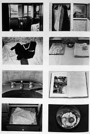
Sophie Calle 'The Hotel'
Sophie Calle became a cleaner so she could get into people’s hotel rooms. In the series she photographs a room, photographs their personal items and mentions if they have been moved and writes a diary throughout the guests’ stay, deducing what she can about them by what they leave in their rooms e.g.
"Room 25 “ Thursday 19. Noon. He is gone. He has left his orange peels in the wastebasket. Three fresh eggs on the windowsill, and remains of a croissant which I polish off. I shall, miss him."
The photographs made you feel as if you had sneaked into the people’s rooms too and might be caught out at any moment. Calle's work was included in Tate Modern's 'Exposed' exhibition. The exhibition was looking at the issue of voyeurism and how it has played a role in photography. It makes you consider the intrusive role that photography and surveillance can play in our society. Exposed looked at pictures made secretly, without people's permission, from the 19th century to the present day. Photographs gave a shocking, illuminating and witty perspective on iconic and taboo subjects.
'The English Sunrise' (1972) by Brian Rice and Tony Evans is a beautiful book designed around a series of photographs of sunrise motifs. Many cultures have used the Sunrise motif from Communist China to Art Deco Designs. It is often a symbol of hope and optimism. However, this small book seems very English and from a period that there are less and less traces of.
'The English Sunrise' (1972) by Brian Rice and Tony Evans is a beautiful book designed around a series of photographs of sunrise motifs. Many cultures have used the Sunrise motif from Communist China to Art Deco Designs. It is often a symbol of hope and optimism. However, this small book seems very English and from a period that there are less and less traces of.
From the disappeared world to the rounded edges Even's Photographs in 'The English Sunrise' demonstrate that the by focussing on one element in the world around us becomes a world in itself.


